Branding | Sanchild Foundation
One of my favourite pro bono projects from last year in collaboration with my non-profit @dogoodnamibia was the branding of a local non-profit. @sanchild_foundation aims to help youth from marginalized communities in the northern regions of Namibia to complete their education, craft better futures for themselves and become role models in their communities.
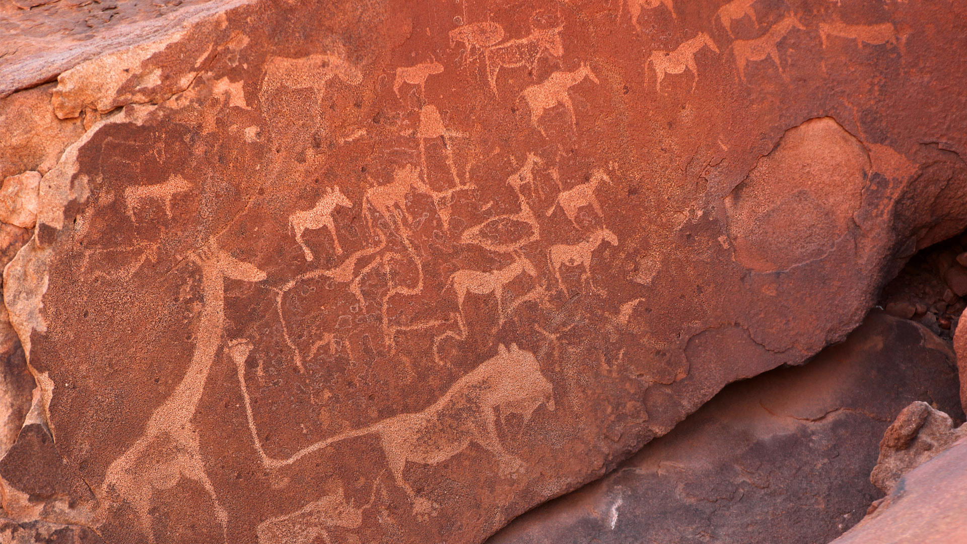
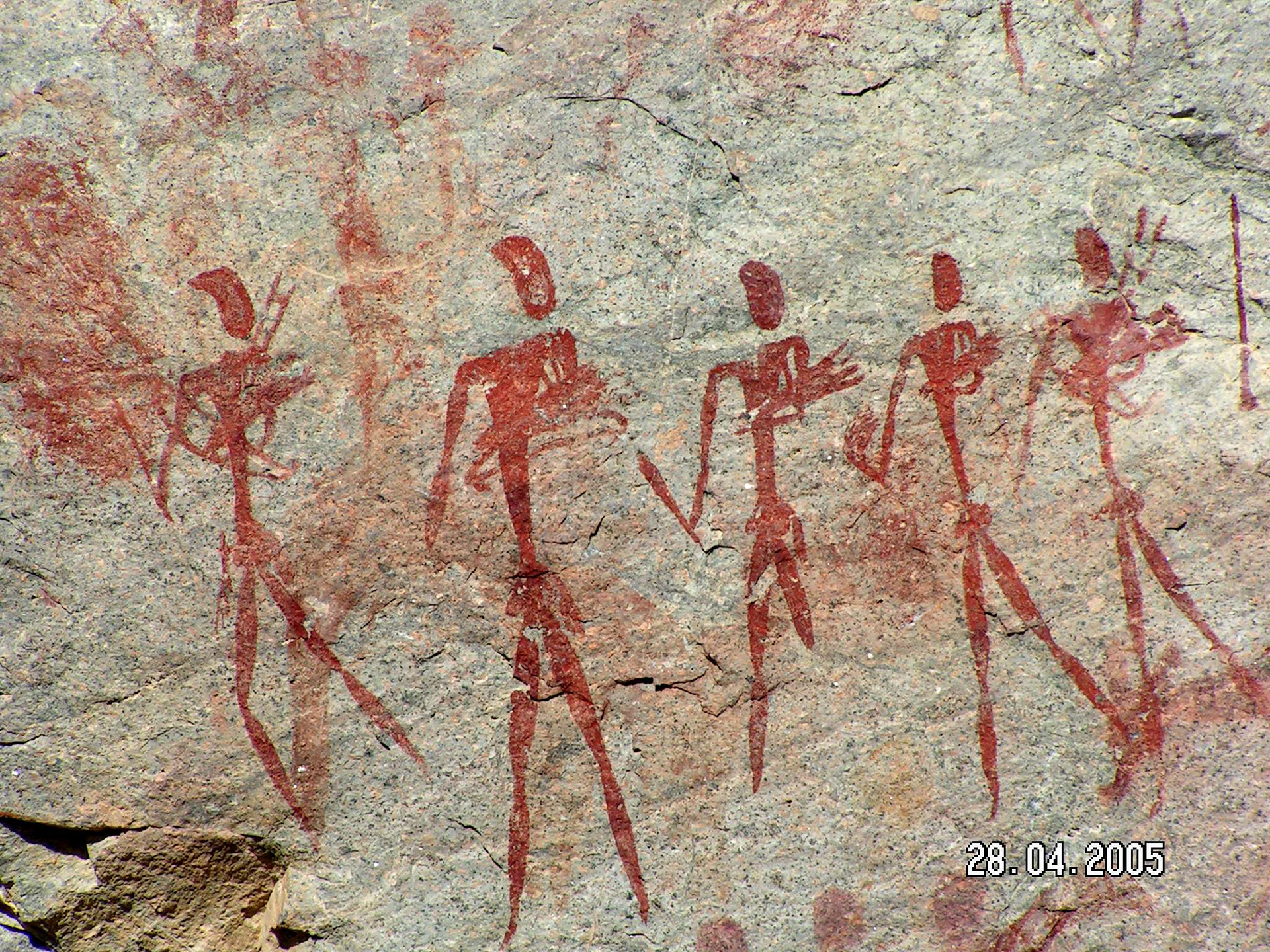
The name is inspired by the San people who are considered by many to be the earliest inhabitants of the region. S.A.N are also the initials of the founder, who is a San child herself. The design is inspired by San rock paintings in the area and the playfulness of children. The brand colours are drawn from the infamous red Namibian sand and natural pigments used in rock paintings. We wish them the best of luck with their vision and mission.
The name is inspired by the San people who are considered by many to be the earliest inhabitants of the region. S.A.N are also the initials of the founder, who is a San child herself. The design is inspired by San rock paintings in the area and the playfulness of children. The brand colours are drawn from the infamous red Namibian sand and natural pigments used in rock paintings. We wish them the best of luck with their vision and mission.


